The keyword "Responsive Web Design" means websites that are displayed clearly and attractively on every medium. At LeanPort, for example, we know that the majority of our customers' websites are now visited from a tablet or smartphone. The sizes of the screens vary and our job is to deliver an equally compelling website experience on all devices.

The term "responsive" already includes the procedure. Translated into German this means something like "reacting". It reacts to the screen size and the browser used.
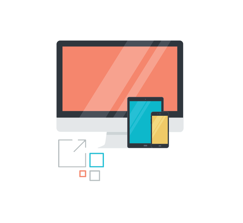
We present you and your company in a versatile way and enable, among other things, a scalability of the fonts, a change in the navigation depending on the screen size or different formats for the graphics used that grow with the user. The complete architecture of each website programmed by us corresponds to the specifications of "Responsive Web Design" and is displayed accordingly perfectly. Our programming team works according to the latest HTML5 standard and CSS3 as well as of course the absolutely necessary "media queries".

This creates websites that completely correspond to your wish for the presentation of your company and are also suitable for new technologies and screen sizes. We keep up with the time and work entirely “state of the art”. This is also made possible by continuously educating ourselves and adapting new techniques at an early stage.

In short: we make you and your website future-proof and independent.