

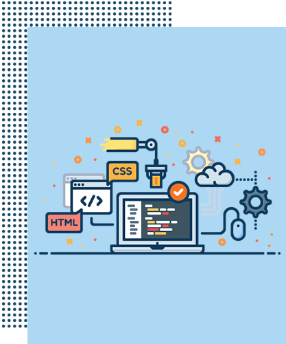
We present you and your company in a versatile way and enable, among other things, a scalability of the fonts, a change in the navigation depending on the screen size or different formats for the graphics used that grow with the user. The complete architecture of each website programmed by us corresponds to the specifications of "Responsive Web Design" and is displayed accordingly perfectly. Our programming team works according to the latest HTML5 standard and CSS3 as well as of course the absolutely necessary "media queries".

